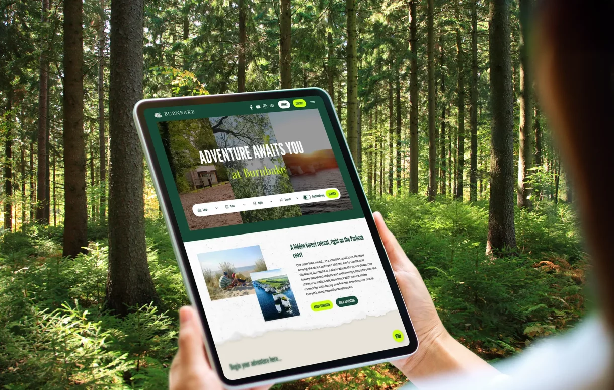
Making it easier to escape
Burnbake is one of those places that sells itself the moment you arrive. Tucked away in the Purbeck countryside, surrounded by woodland and close to some of Dorset’s best beaches and landmarks, it has everything you want from a proper escape: space, fresh air and that lovely feeling of being away from it all. The challenge was making sure the website felt just as easy.
The existing site did the job, but over time it had become harder to navigate. Important information wasn’t always easy to find, the visual hierarchy needed strengthening and the different ways to stay at Burnbake weren’t as clear as they could be. So the brief wasn’t simply to make it look better. It was to make it work better too.
A fresher feel
We started by refreshing the visual language while staying true to Burnbake’s woodland setting. The colour palette was strengthened with a more vibrant green and brighter accents to add contrast and help guide the eye. Typography was simplified and made more legible, and the overall hierarchy was sharpened so visitors can understand what they’re looking at more quickly.
We also introduced a more layered visual style, using torn-paper edges, topographic lines and animated journey paths inspired by the landscape around Burnbake. The result feels more contemporary, more distinctive and, importantly, still very much like Burnbake.
Making the journey clearer
A big part of the project was simplifying how people move around the site. The previous navigation had begun to struggle under the weight of multiple accommodation options, making key pages and booking routes harder to find than they needed to be. We replaced this with a clearer mega menu and created audience hubs for families, couples and dog-friendly stays. That means visitors can now head straight to the information that matters to them, without having to work their way through pages that don’t.
Clearer choices
We also made the accommodation offer easier to understand. Burnbake has a range of luxury lodge options, a rambling farmhouse, alongside glamping and camping, and it was important that visitors could quickly see the differences between them. The new site makes those choices much clearer, with stronger signposting and more direct routes to booking.
Designed mobile-first
Most people don’t browse holiday websites sitting neatly at a desk. They’re looking on phones, in snatched moments, often while comparing dates, prices and options. So the new site was designed with mobile in mind from the outset, rather than treating it as an afterthought. Desktop and mobile were developed side by side to make sure the experience feels just as considered on a small screen as it does on a large one.
A smoother path to booking
We also looked closely at the booking journey. The updated process not only shows availability for the stay someone is interested in, but can also suggest alternatives, whether that’s a different accommodation type or a different date. It sounds simple, but these little improvements can make a big difference between someone giving up and someone booking.
The bigger picture
For us, good website design is never just about how a site looks. It’s about how quickly people understand where they are, how easily they can find what they need and how confident they feel taking the next step. The new Burnbake website brings all of that together in a way that feels clearer, fresher and much easier to use. And most importantly, it gives visitors a better sense of what Burnbake has always done so well:
Making it easy to escape.